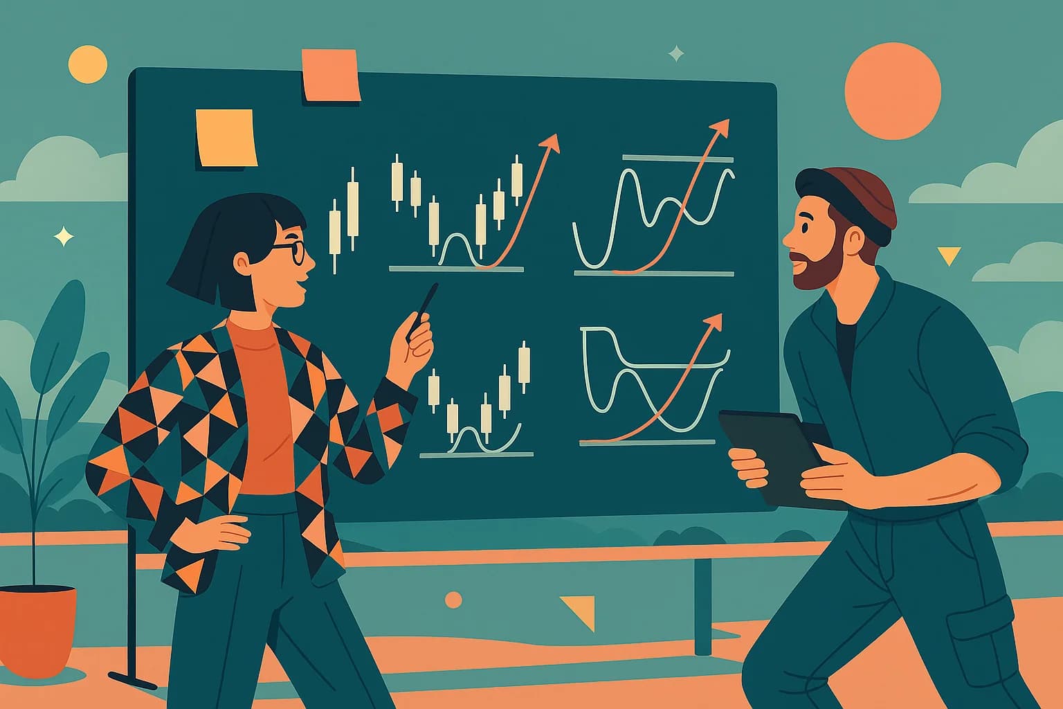

Making sense of market language
Step onto any trading floor—or even scroll through Twitter—and you’ll hear traders throw around words like “RSI oversold,” “MACD crossover,” or “double top.” It can feel like a secret code. The truth is, these terms aren’t interchangeable; they describe different layers of how we read the market. Indicators measure the environment, signals mark turning points, and patterns provide the bigger picture. Put together, they’re a framework for turning noisy charts into structured decisions.
Indicators: the measurements behind the scenes
Indicators are the calculators of the trading world. They take price and volume—the raw ingredients—and run them through formulas that help us make sense of what’s happening. RSI, for example, compresses weeks of buying and selling into a number between 0 and 100, so we can see when enthusiasm might be overheating. MACD smooths out moving averages and tells us when momentum is fading or picking up. Bollinger Bands stretch and contract around price, letting us know when volatility is drying up or about to surge. None of these shout “buy” or “sell” on their own. Instead, they’re like instruments on a dashboard, giving you the readings that matter while you steer.
Signals: when the market taps you on the shoulder
A signal is what happens when those indicator readings cross a threshold or fire off a condition. If RSI falls below 30, that’s not just a reading, it’s a potential oversold signal. When MACD crosses above its signal line, momentum has just shifted. A golden cross—when the 50-day moving average rises above the 200-day—is another classic example. These aren’t guarantees, but they’re moments when the market taps you on the shoulder and says, “Something’s changed. Pay attention.”
Patterns: the story in the candles
Patterns are where charts become visual storytelling. A hammer candlestick after a steep decline is like the market saying, “Sellers tried, but buyers punched back.” A head and shoulders formation at the top of a long rally can feel like exhaustion written across the chart. Triangles, flags, and cup-and-handle shapes all tell us something about how price is coiling, pausing, or gearing up for the next move. Unlike signals, which are binary, patterns are about context: where are we in the bigger picture, and what story is unfolding?
Why all three matter together
On their own, each element has value. But their real power comes in combination. Imagine a stock that’s been climbing steadily for six months. On the chart, it forms an ascending triangle—a bullish pattern. At the same time, MACD flashes a fresh bullish crossover, while RSI is firm but not overheated. That alignment of indicator, signal, and pattern is what gives traders conviction. It’s not just noise; it’s a theme building across multiple instruments of analysis.
How STKLY ties it together
Scanning every chart manually for these nuances would take hours every day. That’s where STKLY steps in. We’ve built alerts that package the best combinations—Momentum-RSI-MACD to catch exhaustion and reversals, Breakout (52-Week / Squeeze) to spot fresh highs and volatility releases, and Relative Strength Momentum to highlight market leaders who tend to keep leading. Instead of chasing hunches, you get structured, rules-based signals delivered right when they matter, complete with the context of patterns and indicators that make them meaningful.
The bottom line
Indicators measure. Signals trigger. Patterns tell the story. Together, they turn a messy chart into a playbook. With STKLY, you don’t just learn these concepts—you put them to work with real-time alerts that help you focus on opportunities with stronger odds. The market will always be noisy, but the right framework cuts through it and helps you act with confidence.